Fixed and fluid layouts
In general, you choose between layouts that are "fixed" or "fluid".
Fixed layouts have a limited number of static widths based on the width of the browser window.
Flued layouts are basically "page width".
Test resize your browser.
Fixed layout
These values will change as you resize your browser:
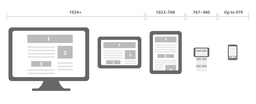
Large devices, Desktops (≥1200px)
Medium devices, Desktops (≥992px)
Small devices, Tablets (≥768px)
Extra small devices, Phones (<768px)
For phones ("extra small devices"), this layout is the width of the browser/device.
For larger devices, there is a maximum fixed width.
Fluid layout
These values will change as you resize your browser:
Large devices, Desktops (≥1200px)
Medium devices, Desktops (≥992px)
Small devices, Tablets (≥768px)
Extra small devices, Phones (<768px)
This layout is always the width of the browser/device.